
Platt scaling for probability calibration
You are tasked to build a binary classifier: the clients want to know whether a customer will make a purchase in a certain category during next week. Game on!
This is a daily task
You bring out your well-tuned routine: carefully inspected and cleaned the data; set up the cross-validation training pipeline, tried various types of models, even threw in a few engineered features. All are well.
The clients are, however, not so easy to satisfied, as they have every right to criticize. They ask for some measures of the model’s quality. You present the savvy clients a full suite of metrics, such as precision, recall, and even area under the curve (AUC) of the receiver operating characteristic (ROC). Fully aware of the limit of any statistical model, the clients are seemingly pleased.
Before signing off, one last question from the group: if we are interested in the probability of the customer making a purchase, can you provide that? Without any doubt, you said yes. As a matter of fact, those probabilities are already calculated by the model! Look, below is the histogram of the predicted probabilities (the procedures to create this plot can be found here):
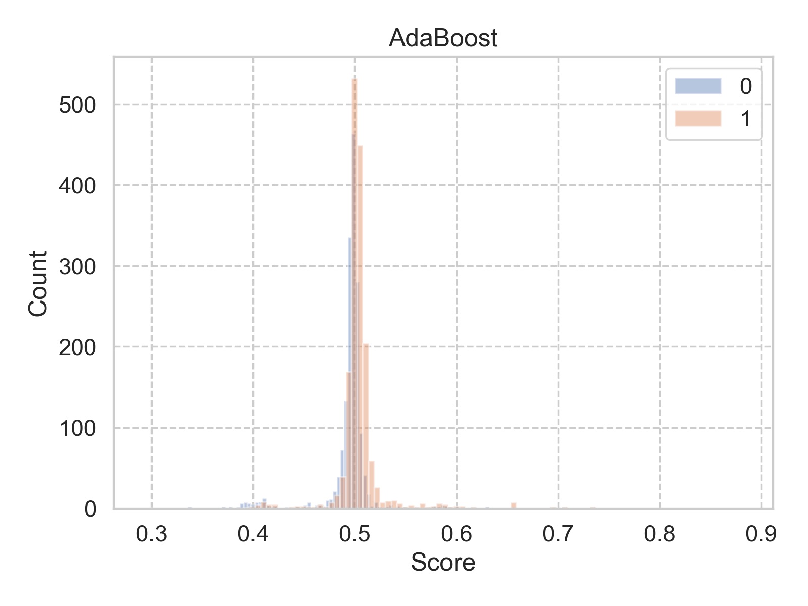
What is going on? Most of the predicted probabilities (labeled as “score” in the figure) are tightly clustered within a 0.1 span around 0.5. You feel your reputation is on the line, so you want to dig deeper.
Does it matter?
Back to the desk, you ask yourself, does this peculiar distribution matter? If all one cares about is the relative ranking of the samples, then such extreme distribution would not matter. Also since AUC of ROC is calculated based on ranking, so long the rankings are preserved, we can not tell the difference of different shapes of distributions. But there are cases, we do care about an accurate distribution, when we treat the predicted scores as probabilities.
Let’s consider the following scenario: your clients ask for two models, one to predict a customer’s propensity of purchase in category A, and the other to predict the same customer’s propensity of purchase in category B. Categories A and B are mutually exclusive, and your company’s product line only consists of categories A and B. The clients want to know both propensities for the same customer, to better serve him/her. If all the scores (interpreted as probabilities) predicted by model A lie in the range [0, 0.5), and all the scores predicted by model B lie in the range [0.5, 1], when used side-by-side for the clients’ purpose, they are of little use. Even each of the models can have perfect metrics (say, AUC of ROC of 0.99), they can not serve the clients.
What is the issue?
Now we understand that we do prefer a model whose predicted scores can be directly used as probabilities. Apparently, the histogram we have above would not make the cut. But how bad it is? To, at least visually, inspect the deviance, we can use a reliability diagram. The construction of the reliability diagram is very similar to that of the ROC. Given a set of samples with true labels, the procedure is:
- The samples are ranked by their predicted scores output from the model.
- Then the samples are bucketed into \(N\) equal size bins.
- For samples in bin \(i\), we calculate two things: one is the mean of the predicted scores, as \(x_i\); the other is the fraction of the samples with true positive label, as \(y_i\).
- Plot all the \((x_i, y_i)\), calculated from all \(N\) bins.
If the predicted scores truly reflect the underlying probability distribution of the data (which we can not observe), one would expect all the points should lie on the diagonal line. Following the above procedure, we can make the reliability diagram for our previous model as shown below.
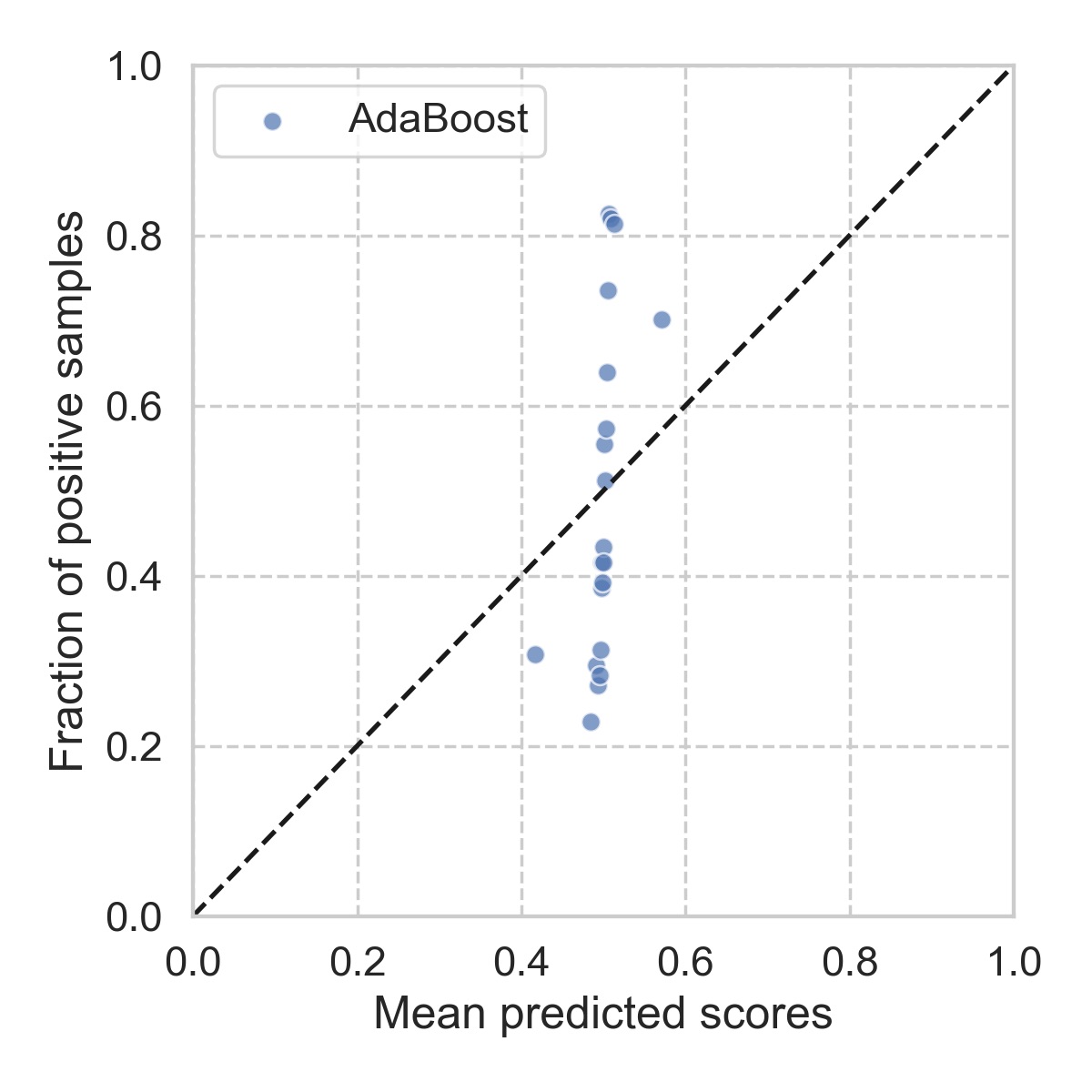
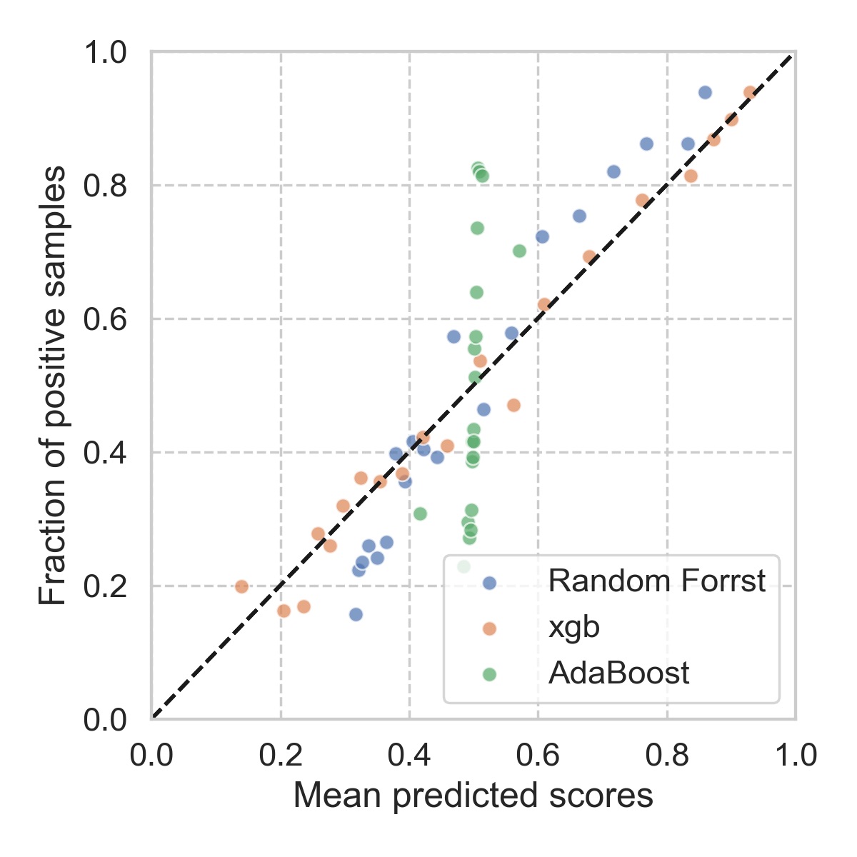
Clearly, it looks pretty bad. At this point, you would almost want to try other types of models, and see how they behave up against the reliability diagrams. It seems that, for this particular problem, xgboost is the most reliable, followed by random forest. The details of each model can be found here.
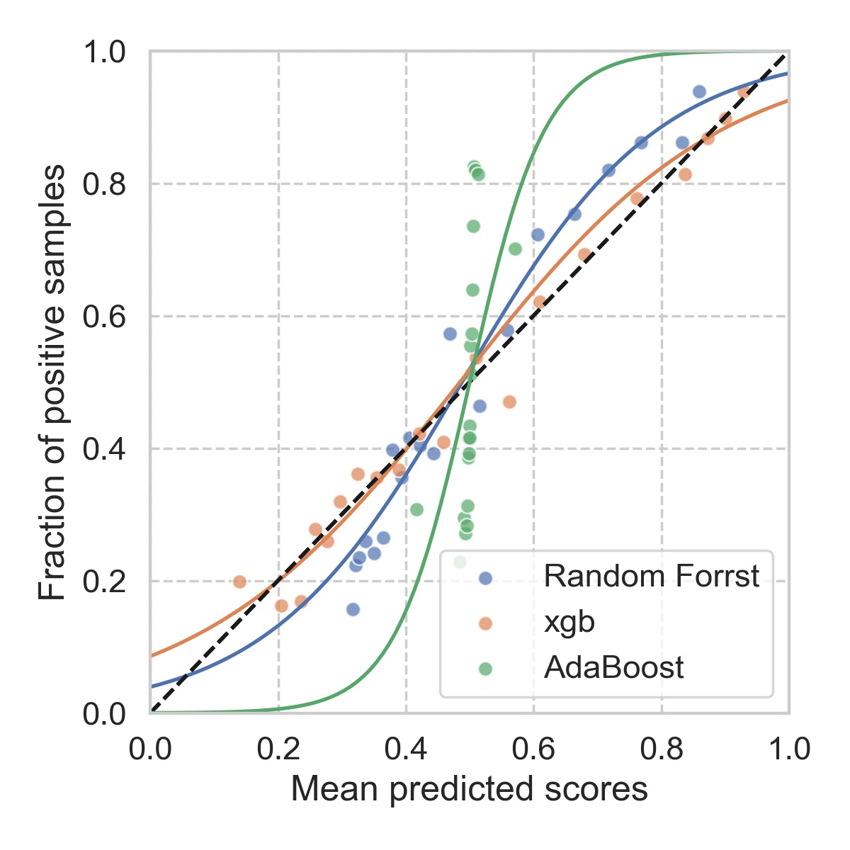
The natural question will be: why? According to Alexandru Niculescu-Mizil and Rich Caruana, at least empirically, the reasons are:
… maximum margin methods such as boosted trees and boosted stumps push probability mass away from 0 and 1 yielding a characteristic sigmoid shaped distortion in the predicted probabilities.
Models such as Naive Bayes, which make unrealistic independence assumptions, push probabilities toward 0 and 1.
Other models such as neural nets and bagged trees do not have these biases and predict well-calibrated probabilities.
In any case, using reliability diagram can help us to visualize the extent of the problem, as it also provides the clue how we can fix this issue.
Platt scaling for calibration
Ideally, we want the model outputs a reliability diagram that goes straight along the diagonal. If that is not what we see, then, let’s train another (simple) model to make it happen. It sounds brutal, but it is simple, and it gets what we want.
A very common method used for this purpose is Platt scaling, where one simply fits a univariate logistic regression model for this purpose. To set up such calibration, one sets aside a small portion of the original data at the very beginning (to prevent overfitting), once the main model is trained, we then apply the main model to the calibration dataset. The predicted scores are then used as the input to the logistic regression model (hence univariate), and the corresponding labels are used as the truth. For our toy problem, the results are shown below.
As we have noticed, such calibration will not change the ordering of the samples, since the logistic function is monotonic. Therefore, the AUC of ROC will not be affected by the calibration, as confirmed in the table below. However, the score distribution will affect the logloss, since it tries to “stretch” the scores more evenly between [0, 1]. As a result, we get a lower logloss.
| AUC, before | AUC, after | Logloss, before | Logloss, after | |
|---|---|---|---|---|
| Random Forest | 0.772 | 0.772 | 0.582 | 0.570 |
| xgboost | 0.780 | 0.780 | 0.561 | 0.561 |
| AdaBoost | 0.714 | 0.714 | 0.684 | 0.671 |
Conclusion
We have seen that, in classification problems, if one cares about the predicted scores, and intends to interpreted such scores as probability, calibration step such as Platt scaling should be applied. Depending on the nature of the problem, and the exact model used, the effect of calibration may or may not be significant. Nevertheless, it is something to keep in mind, and handy to have in the toolbox.

Leave a Comment