
The fundamental problem of causal inference, part 2
Recap from part 1
In the last post we have outlined:
- The issue at hand: identifying causal relation;
- Its difficulty: the fundamental problem of causal inference, FPCI;
- One modeling framework to solve the problem: randomized treatment and control group;
- The corresponding evaluation metric to assess the quality of a model: Q coefficient.
In this post, we will discuss few different types of models under this theme, and apply them to a sample dataset for comparisons.
How about that A/B test
Before we go quantitative, let me remind myself why we are doing this? Isn’t this what A/B test is designed for? Well, yes and no. Yes since we can consider the treatment / control split as A/B tests. No since A/B test is designed to answer the question: which version works better? Here we already know the answer: the treatment group (otherwise we have a serious problem). In another word, we already know that, overall, the treatment group works better than the control group. However, our goal is, can we do even better than that, for example, to make the response rate from the treatment group even higher?
As the marketing pioneer John Wanamaker stated: “Half the money I spend on advertising is wasted; the trouble is I don’t know which half.” We are trying to find out which half.
The models
Two-model-difference approach
Given that we have essentially two datasets: responses from the treatment group, and responses from the control group, we can build one binary classifier for each group, using any model of choice (logistic regression, random forest, etc). Let’s call them \(m_T(X)\)and, \(m_C(X)\) respectively, where \(X\) is the feature vector that characterizes a customer. Here we also assume that the two models share the same set of features. The output of each model, \(P_T(X)\), \(P_C(X)\) can be interpreted as the probability of response when the customer is treated, and not treated. The final score that is generated by the intended model, for an individual customer, is then \(P_T(X) - P_C(X)\). This can be simply understood as the increase of propensity if treated. Since the outputs from both \(m_T(X)\)and \(m_C(X)\)are bounded between 0 and 1, the output from this “two-model-difference” model is bounded between -1 and 1. Note that we train \(m_T(X)\)and \(m_C(X)\) independently with the common objective function for a binary classifier (e.g., logloss), hence their “qualities” can be evaluated with common metrics used for any binary classifier (e.g., AUC of ROC).
We have built a model! Now let us evaluate this model, with the Q coefficient defined in last post. Recall how Q coefficient is calculated:
- Apply the model to the test dataset of the treatment group (calculate \(P_T(X) - P_C(X)\) for everyone in this treatment group), and with the ‘true label’, generate the two cumulative gain curves (one for the best case, one for the predicted case).
- Apply the model to the test dataset of the control group (calculate \(P_T(X) - P_C(X)\) for everyone in this control group), and with the ‘true label’, generate the two cumulative gain curves (one for the best case, one for the predicted case).
- With the 4 cumulative curves, calculate the Q coefficient.
The data used is the modified Hillstrom Email marketing dataset, whereas the treatment group is sent Women’s Email, and the control group is not sent any Email. We only use the binary ‘Visit’ variable as labels.
The figure below shows the cumulative curves created according to the above procedure. The binary classifiers are both random forest (from sklearn), with respective AUC on the test dataset of 0.612 and 0.658. The (number of response) / (number of total) is 972 / 6417 for the test dataset of the treatment group, and 679 / 6392 for the control group.
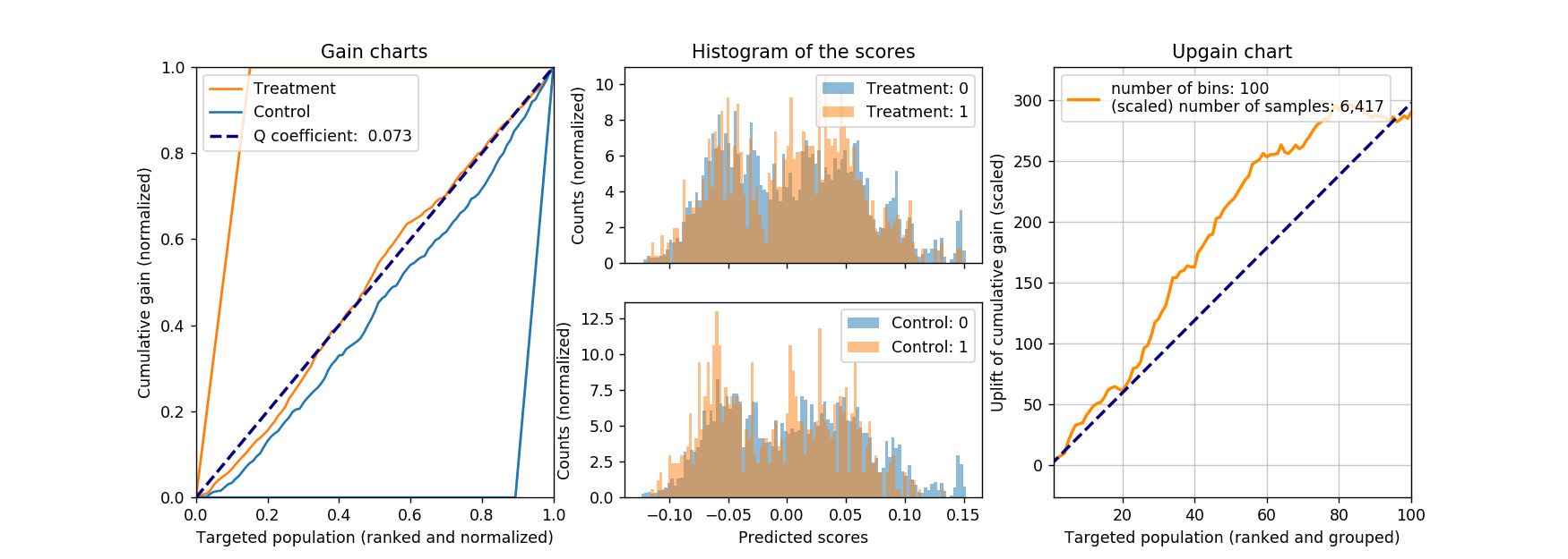
The resulting Q coefficient is about 0.07 in this case, not great, but at least positive. For reference, the histogram of the model scores on the (test) treatment and (test) control sets are shown as the middle plot, with their corresponding true labels. It is worth noting that, when the model is evaluated on the control group, we see that those not responsed (with label of 0) seem to group towards high-score end, and that is what we want! Ideally, we want to see the reversed case in the treatment group (responsed customers group towards high-score end), but unfortunately it is not in current case.
What is also shown as the right-most figure is the upgain of the cumulative gain. This curve is created by subtracting the scaled “control” cumulative curve from the “treatment” cumulative curve. In essence, we first scale the control group to the same size of the treatment group, therefore, the number of response will change from 679 to 681.7, and the change of number of response will change from (972 - 679 =) 293 to 290.3 accordingly. The difference in the cumulative gain (or as I call it, upgain) curve can tell us, how the model will perform, as we target different portion of customers, from best to worst. Of course if we target all the customers, we will capture all the upgains, arriving at the top-right corner of the upgain chart.
Other than directly express gain between the treatment and control group, there is another advantage of using the upgain chart. Recall that there is some unit cost associated with the marketing action, therefore, as we target more customers (moving from left to right in the upgain chart), the total cost increases accordingly, diminishing the upgain, as well as return on investment (ROI) along the process. If the a maximum ROI is the goal of the campaign, then the upgain chart can be used to advise the total number of marketing actions.
Class-variable-transformation approach
The two-model-difference approach makes intuitive sense, and it is also straightforward to implement. However, it is not designed to directly optimize the objective function that we care about, namely, the upgain. It can be argued that, the two models are designed to minimize their individual loss, and ignore the (possibly) weaker ‘upgain signals’. A single model that aims to directly maximize the increased probability, \(P_T(X) - P_C(X)\), would be better suited.
There are different techniques to achieve this goal, here we will focus one of them, called class-variable-transformation. The idea is rather simple: one just needs to “flip the class in the control set”.
Before we dive into the details, let’s first define some terminologies. Let \(Y\)denotes the binary response from the customer, as \(Y \in {0, 1}\). Let \(G\)denotes the group membership of the marketing action, and \(G \in {T, C}\)whereas \(T, C\)indicates treatment and control, respectively. Let’s also define a new random variable \(Z\) as:
\[Z = \begin{cases} 1, ~~~~&\text{if}~G = T~\text{and}~Y=1;\\ 1, ~~~~&\text{if}~G = C~\text{and}~Y=0;\\ 0, ~~~~&\text{otherwise.} \end{cases}\]Then the probability for \(Z=1\)for a customer (expressed with \(X\)) can be written as:
\[\begin{eqnarray} P(Z=1|X) &= P(Y=1|X)P(G=T|X) \\ &+ P(Y=0|X)P(G=C|X). \end{eqnarray}\]Note that the group membership \(G\) is assigned at random, hence independent of customer attribute \(X\), the above equation can be simplified to:
\[\begin{eqnarray} P(Z=1|X) &=& P(Y=1|X)P(G=T) \\ &+& P(Y=0|X)P(G=C). \end{eqnarray}\]Furthermore, we can treat \(P(G=T)\) and \(P(G=C)\) as the portions of the treatment / control group to the total available customer base. For the sake of simplicity, let’s assume the sizes of the treatment and control group are identical, therefore \(P(G=T) = P(G=C) = 0.5\). If we are dealing with different group size, we can either resample or reweight the datasets.
Once we “get rid of” the group membership piece (with the equal size simplification), the last equation can be expressed as:
\[\begin{eqnarray} 2P(Z=1|X) &=& P_T(Y=1|X) + P_C(Y=0|X)\\ &=& P_T(Y=1|X) + (1 - P_C(Y=1|X)). \end{eqnarray}\]Note that here I insert the subscript \(T\)and \(C\)in accordingly. Finally, we have:
\[\begin{equation} P_T(Y=1|X) - P_C(Y=1|X) = 2P(Z=1|X) - 1. \end{equation}\]The left-hand side is exactly the quantity that we aim to maximize, namely, the increase of probability when given treatment.
Now we are back into our comfort zone: to build a binary classifier. When handed the data from both treatment and control datasets, we first flip the class assignment in the control dataset, then concatenate both datasets, and build a binary classifier to predict \(P(Z=1)\). Bring out your favorite tools, be it random forest, gradient boosted trees, neural networks, go crazy. The final ‘score’ can then be calculated in a straightforward manner, as in the above simplified case, as \(2P(Z=1) - 1\). If we care the relative ranking more than the absolute scores, we can even skip this final step.
We still apply the same evaluation metric as what we have described in part 1, following the three steps outlined in last section. The result is shown in the figure below.
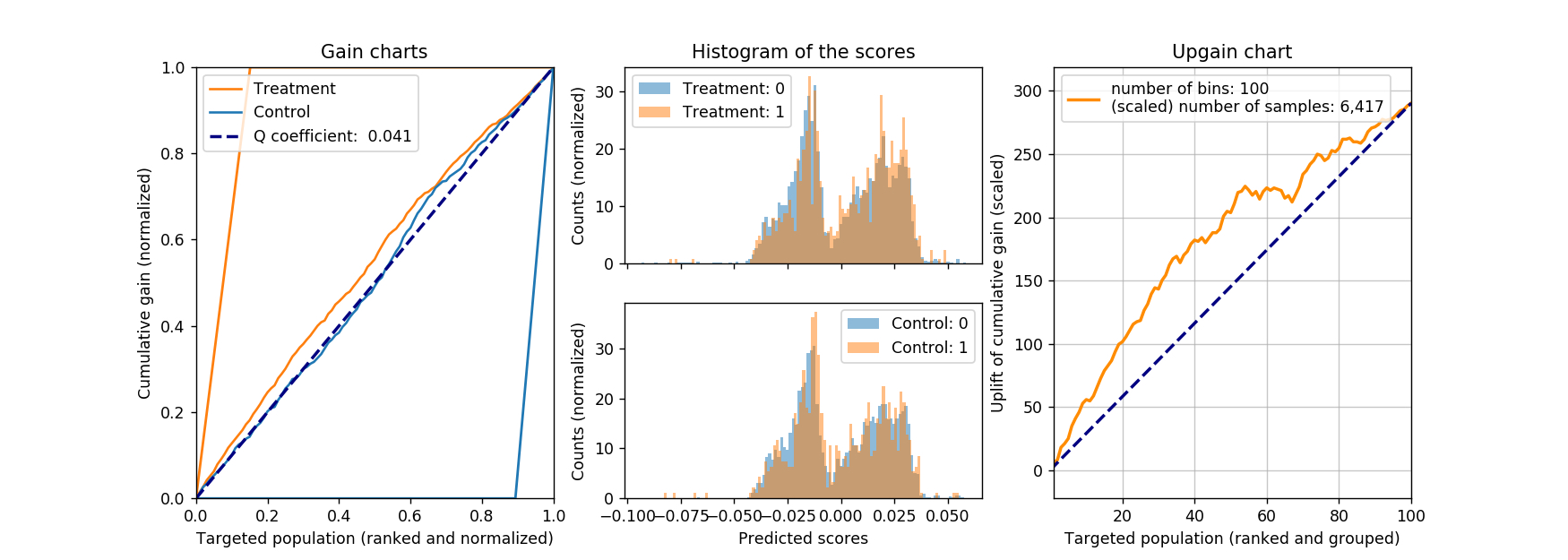
The calculated Q coefficient is about 0.04 in this case (both the treatment and control datasets are identical to the previous case, so it is a fair comparison). We also note that, the AUC of ROC of the binary random forest classifier is merely 0.520, barely better than random guesses, but we don’t lose too much if we look at the Q coefficient. Furthermore, judging from the upgain chart, if we are only going to target 20% of the population, this model can achieve about 100 more ‘hits’, better than the 60-ish hits from the previous model.
One-model-difference approach
There is another appealing method with fitting just one model, that is to make the treatment indicator as a feature: everyone in the treatment group will have this value set to 1, with everyone in the control group having this value set to 0. Then we will proceed to build a binary classifier, with treatment (marketing action) explicitly affecting the outcome (response). When the prediction time comes, we first set everyone’s treatment indicator to 1, to predict their propensity of response when treated. Then we set everyone’s treatment indicator to 0, to predict their propensity when not treated. The final score for each customer will then be calculated as the difference between her two scores.
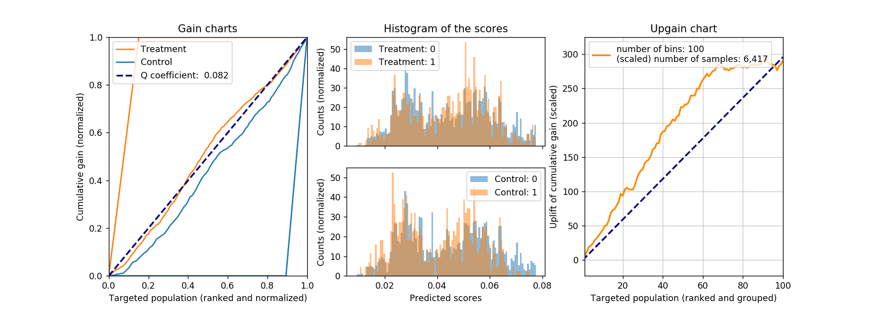
Below is the results of such a model evaluated on the same test dataset. The AUC of ROC for the underlying random forest binary classifier is 0.634. Judging from the Q coefficient and the upgain chart, we would conclude this approach is not worse than any of the previous two.
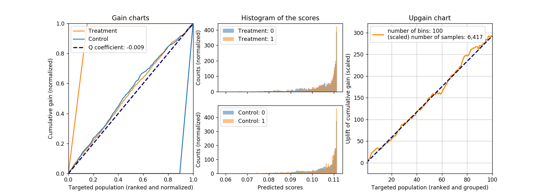
A natural question will arise: will this method work with a linear model, say, logistic regression? Intuitively it should not work. By the nature of a linear model, the change caused by flipping the treatment indicator from 0 to 1 will be the same for all customers, therefore, everyone will get the same score. In the case of logistic regression, the change in logit for everyone is constant, and the final logistic function introduces some weak nonlinearity to spread the final scores. However, it is likely that such nonlinearity is not strong enough. Of course, we need proofs to be convinced: below are the results from a logistic regression model. The AUC for ROC for the classifier is also 0.634, whereas the coefficient for treatment indicator is 0.448, with p-value less than 0.001. So far things are pointing in the right direction: the coefficient is positive (treatment increases the response probability), and statistically significant (small p-value). But the resulting Q coefficient is much smaller than any of that we have seen before, not to mention its negative sign: one can even argue that that Q coefficient is effectively zero. Not surprisingly, we don’t observe any upgain either.
Conclusion and references
In this two-post series, we describe a framework to address the causal inference problem, with few different simple implementations demonstrated with a sample dataset. For more information, please refer to the Rubin Casual Model and the references within. At the heart of this framework is the random treatment / control group assignment. However, in real life, we might not afford such luxury condition. Then casual inference becomes difficult since we can only rely on observational data (e.g., to find the two (almost) identical group of individuals after the action). This will require more effort than just few blog posts (at least for me).
In the space of marketing, there are few excellent works as well. To the best of my knowledge, Radcliffe and Surry started such exploration in 1999, followed by Lo in 2002. These authors have since published series of papers improving their previous works. Rzepakowski and Jaroszewicz have also explored this space, from where I learned the class variable transfromation approach. Above all, this book provides a thorough oerview of how to apply algorithmic thinking in marketing.
As always, we have to acknowledge the admission of ignorance. If there is any logical fallacy, please let me know.


Leave a Comment